How I Built This Site
How I Built This Site
I use my personal website as a place to market myself and exhibit my eye for design. I always spend an inordinate amount of time on it and this time is no different. This time I took a much different approach, as I would like to use this site to publicly share things that I used to share on social media. This comes with a number of requirements for content mangement and hosting. This blog post is a record of the process I went through to build this site.
Requirements
- The site must be designed and styled by me.
- The site must be easy to maintain.
- Hosting must be free or very inexpensive.
- Content must be easily indexed by search engines.
- I want to be able to showcase my projects, photography, and various other things I’ve worked on.
History of the site
Previously hosted at charlesabarnes.com on bluehost, I used to leave the site as a relatively
~2015
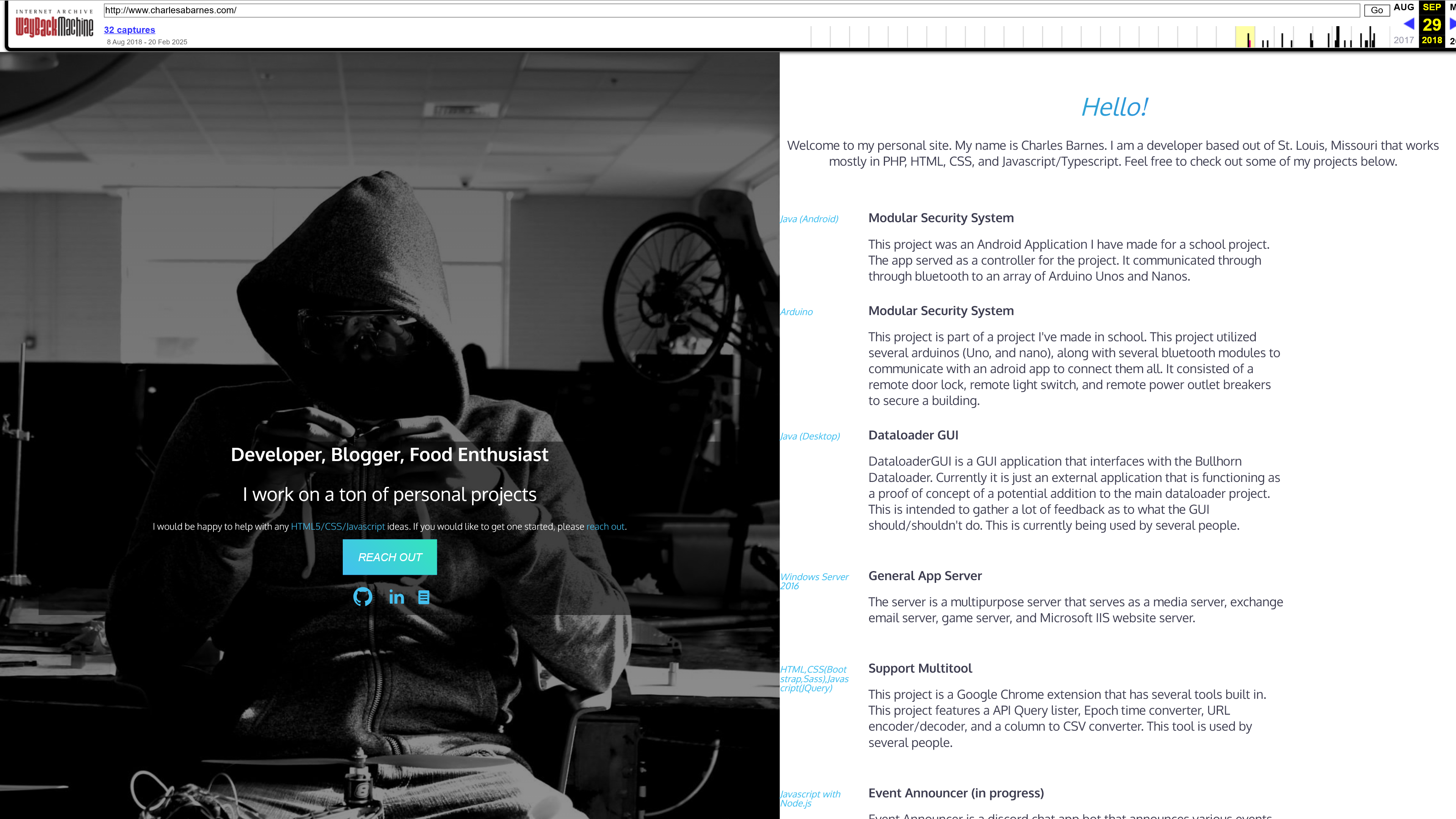
Only found it indexed at earliest in 2018. The first version of the site was a simple static site built with HTML and CSS. It was hosted on bluehost. I made websites before for small businesses and friends and family, but I don’t believe this was my best work. Previous versions of the site was just wordpress sites with no custom design and a theme that I found on the internet.
~2020
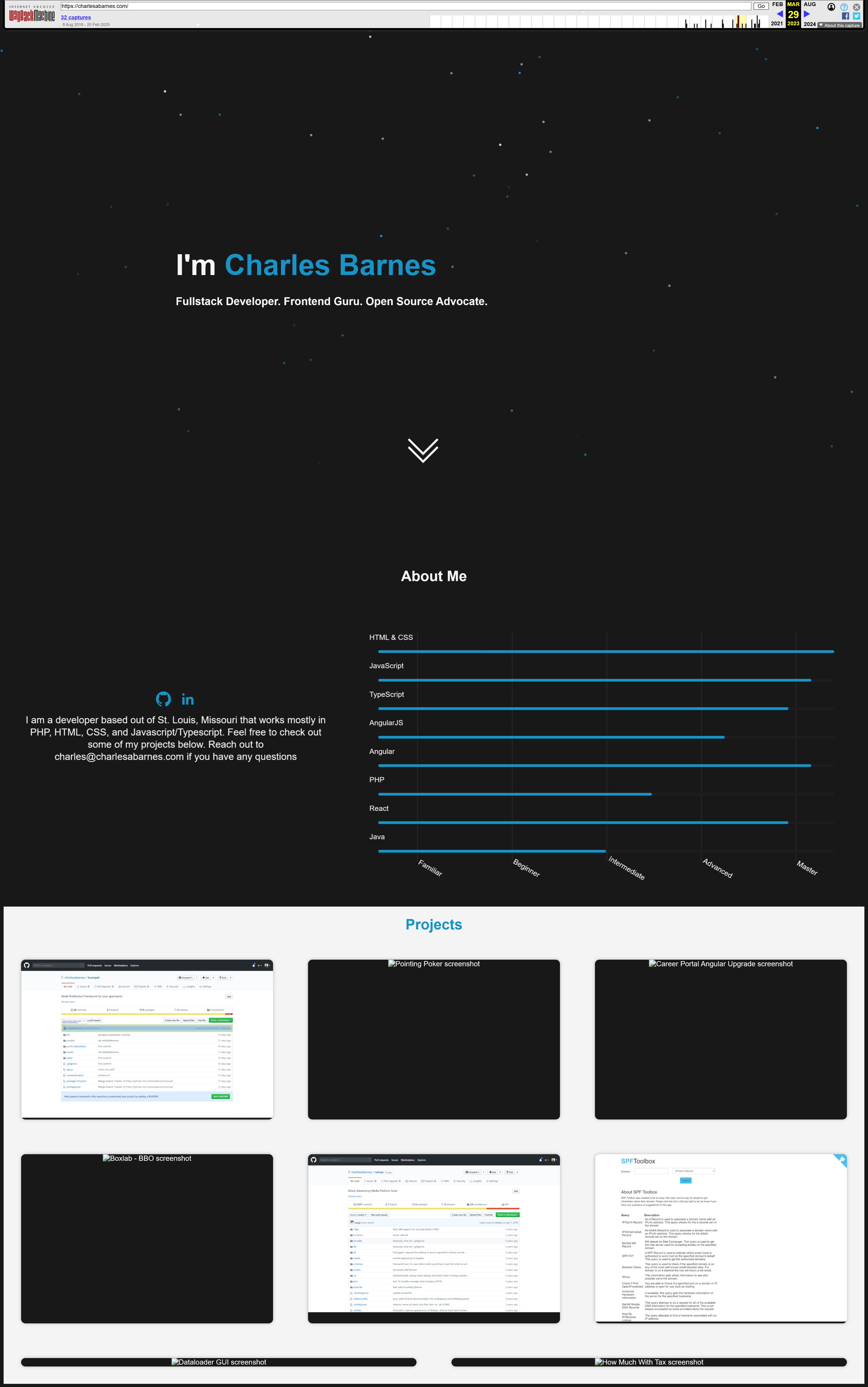
This update to my site was a needed refresh. I decided to give things a go with a new design and a new hosting provider. This was something I wanted to make pretty quickly and flexibly. I was able to get the site up and running in a few hours. I used Angular to build the site, but I didn’t use any of the Angular framework, just vanilla javascript. I used the Angular CLI to generate the project and then I just used the components and services in the project. A lot of the content was driven by json files that I could easily update. The site was hosted on github pages.
Design Process
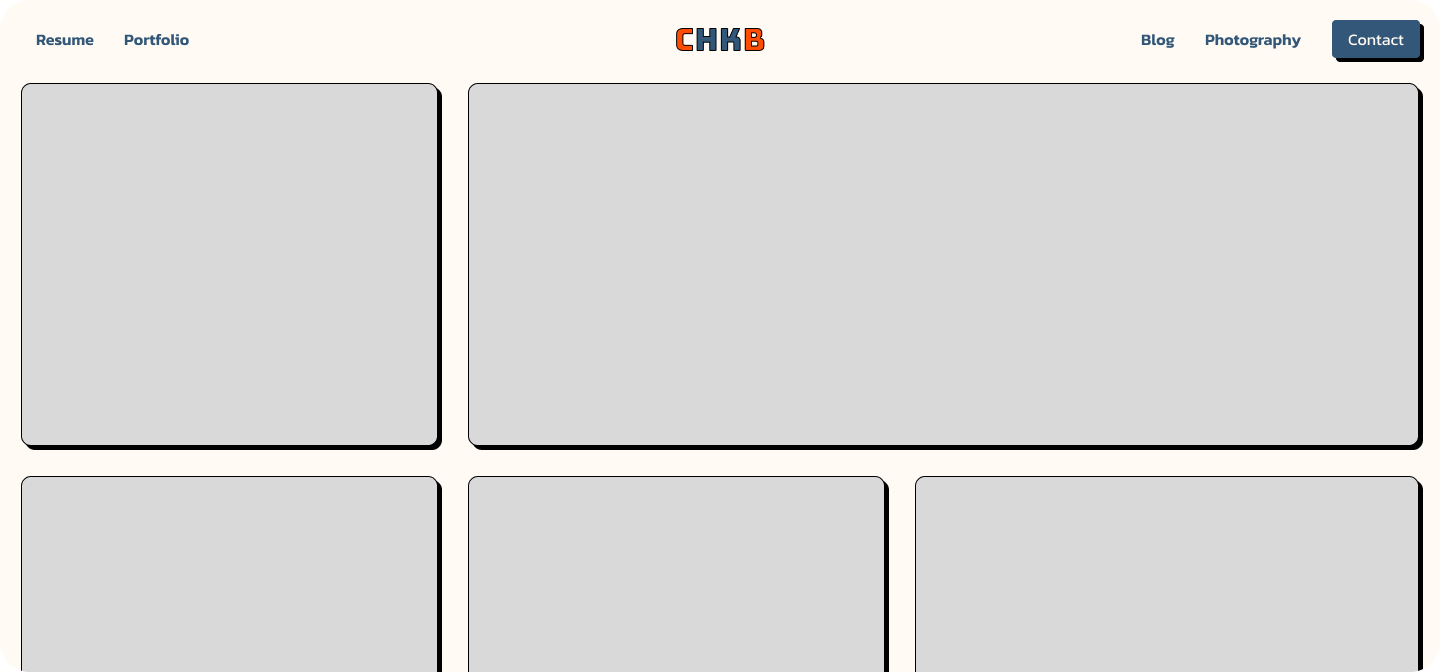
For this revisition I wanted to design the site from the ground up. Figma made this process much easier than before, so I decided to use it to its fullest extent.
Design Concepts
Iniitial Ideas
To start the design process, I was always obsessed with designs that used a lot of tiling icons. I began by using fontawesome and selecting a number of Icons that I believed best represented my interests. I then used Figma to lay them out in a grid.
I then thought I wanted the icons to scroll across the screen with a marquee. I decided to do a layout of the site with the marquee and then I would work on the rest of the site. In this revision I also wanted to highlight why the site is on “chkb.net” and how that title related to me So I decided to highlight the “chkb” in a logo.
Blog Posts
I liked the color selection and layout. It felt good to go for a modern neobrutalist look. I decided it was then time to check out how a list of blog posts would look. with the chosen color scheme.
This was a good start, but it looked amaturish. I didn’t like the color selection at all.
Photography Gallery
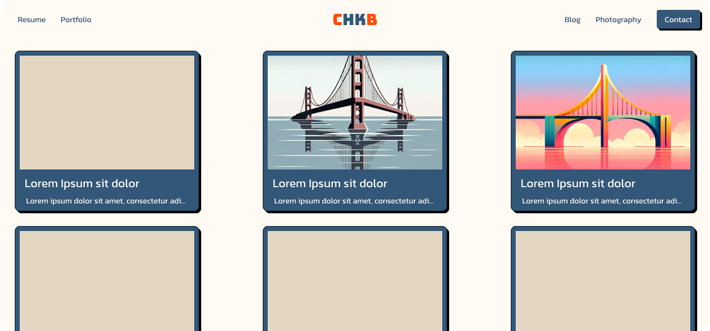
I then decided to try out the photography section without colors and borders. This looked much better.
Grid Concept
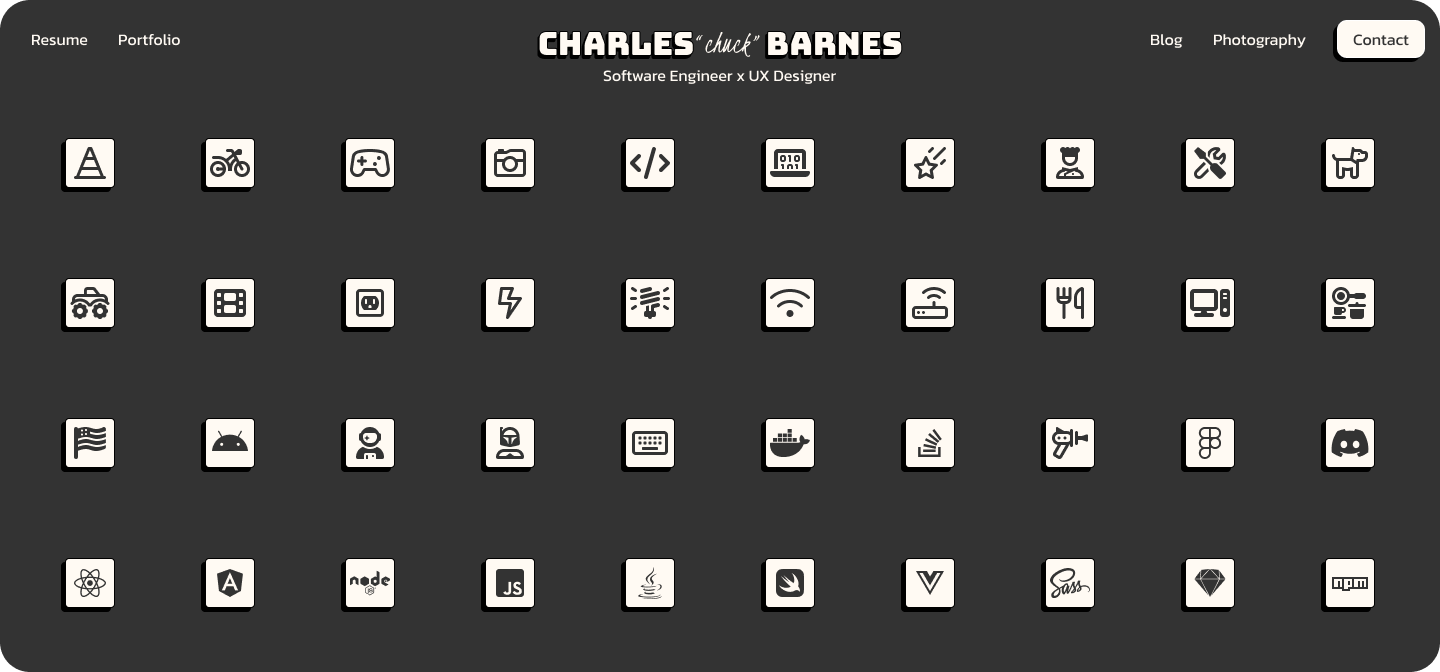
I decided to go with a grid of icons, just as a way to fill the space. I was hoping to have each icon as a clickable link or a way to open a modal with more information.
I iterated here a few times trying to figure out the best color for this. I ended up going with the neutral colors that I have now, but I think I will try out some other colors later.
 |
Final Design
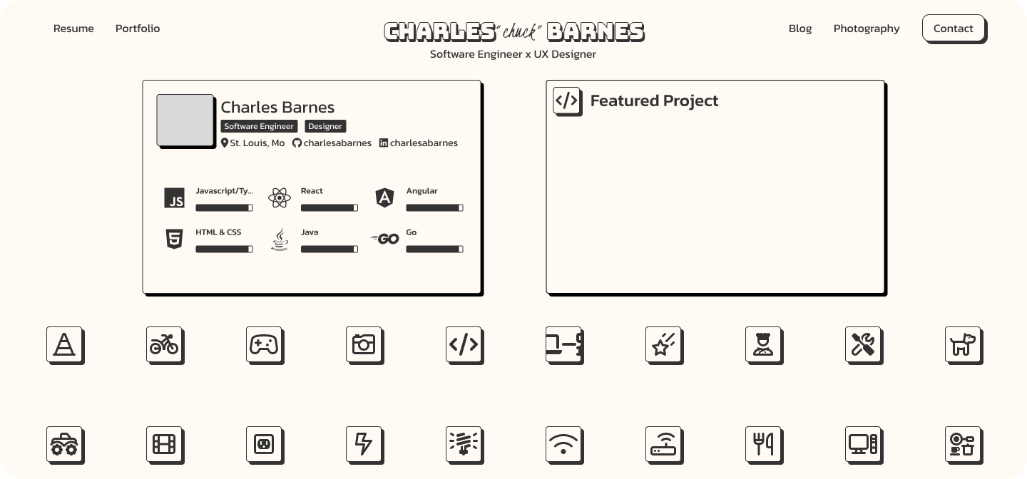
In this final design, we have something that looks like the site I am using now. I didn’t add the informational card to the home page, but I believe it will be something I will add later. I generally dont like the progress bar as a design element, but I have received a lot of positive feedback on it from potential clients and employers.
Development
Development on the site was done in 2 stages basically. The first stage was to get something up and running quickly. The second stage was to add the features and styling that I wanted.
First Stage
wanted to get the site up and running because I was tired of the old site and wanted to get something new up. I also wanted to get the domain chkb.net to use. I was surprised I was able to get such a short domain easily.
This version started off as basic HTML and CSS. I wanted to get keep the site as simple as possible, hand crafting the site as much as possible.
Second Stage
After almost a year of not working on the site, and after a recent start to a job search, I decided to finish out the site that I initially thought up.
I had some frustrations with the basic HTML and CSS, as I needed to repeat myself a lot. So I decided to choose some sort of templating system. I chose Jekyll, as it is a static site generator that is very popular and easy to use. It uses liquid for templating and has a lot of built in features that make it easy to manage the site.
Current Site
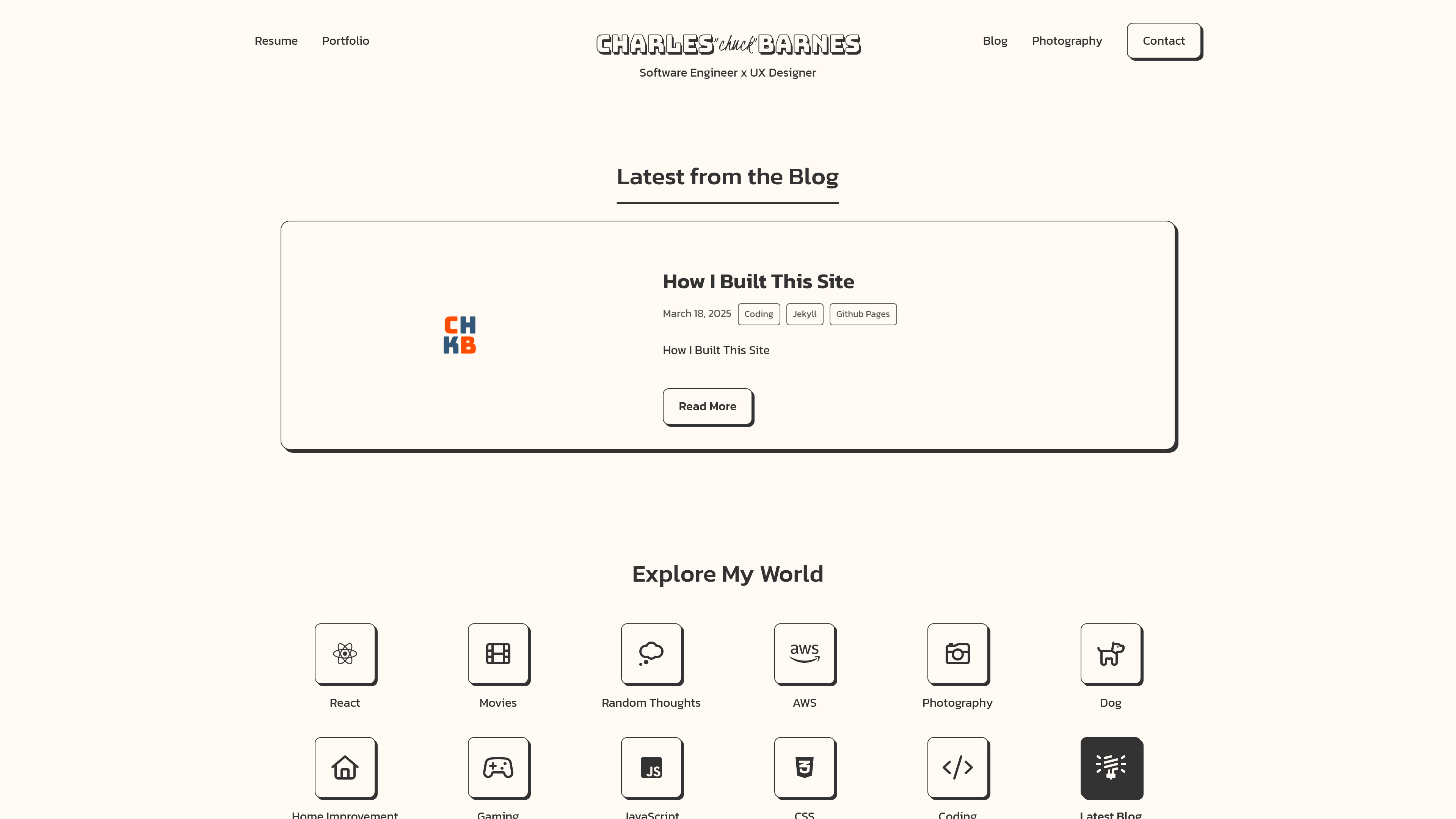 |
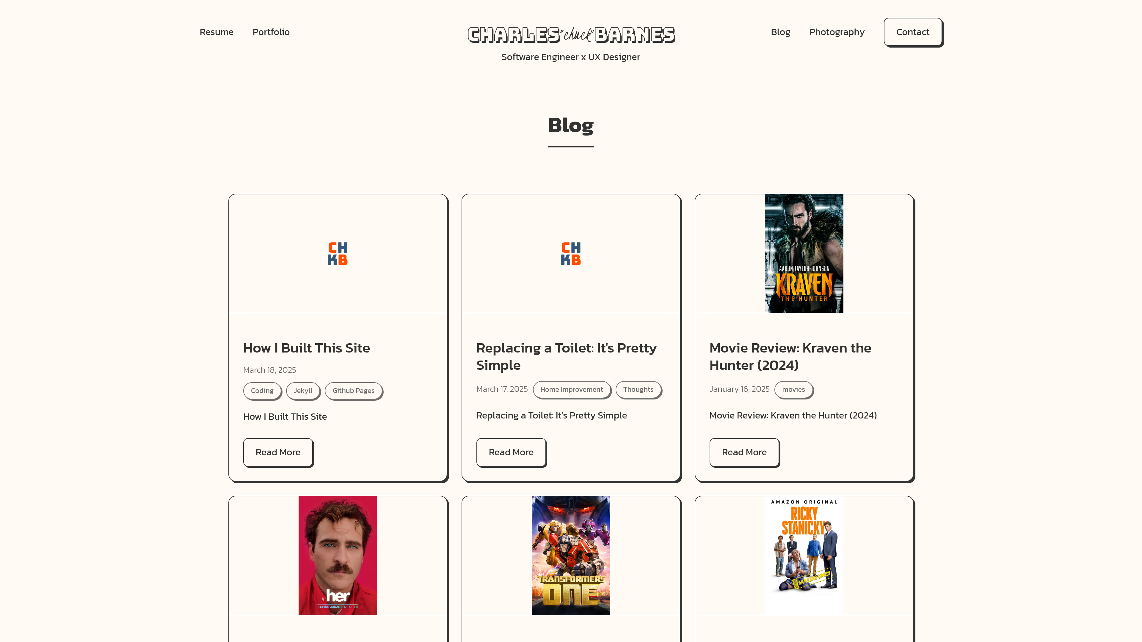 |
|---|---|
| Home Page | Blog Page |
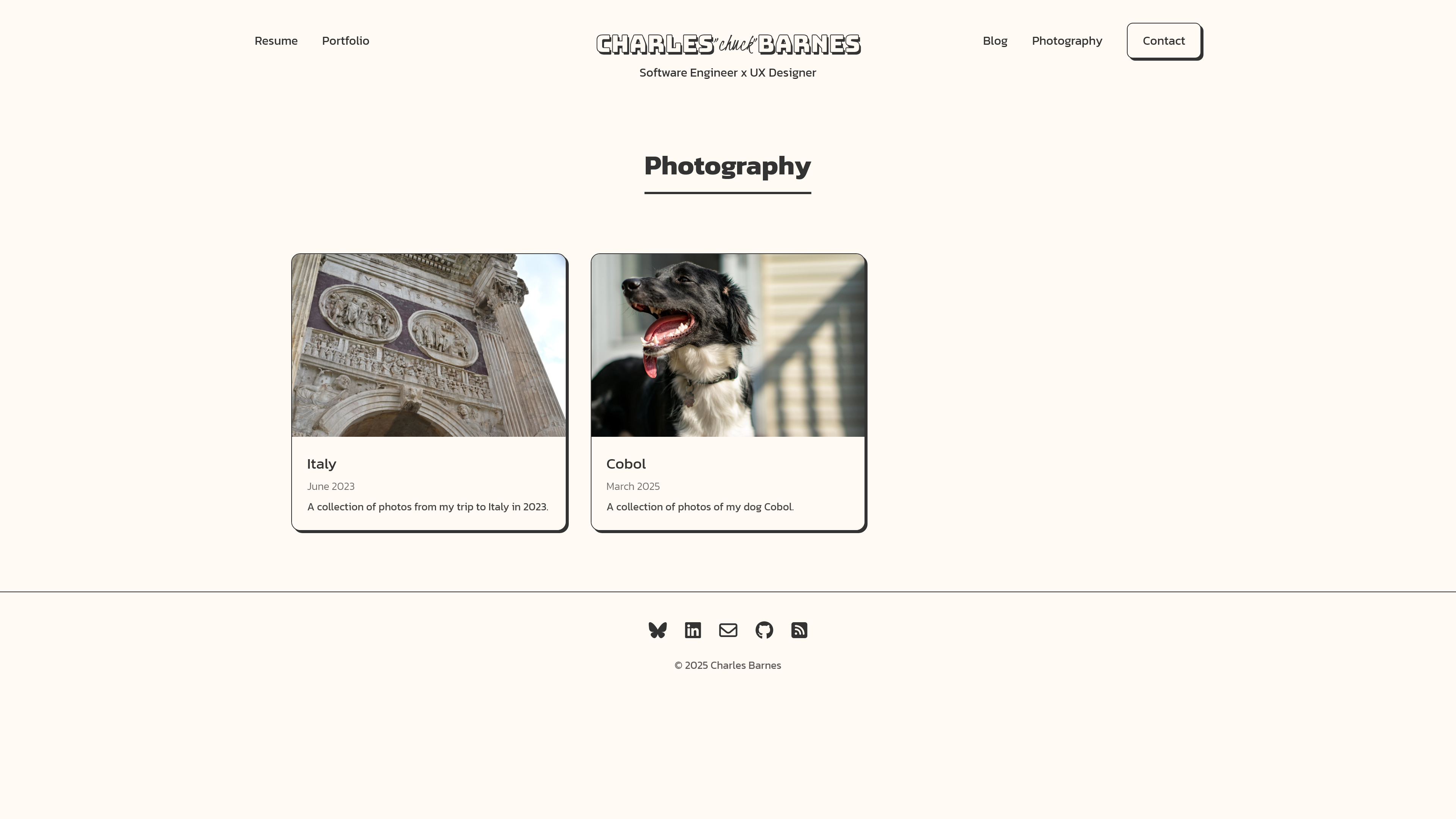 |
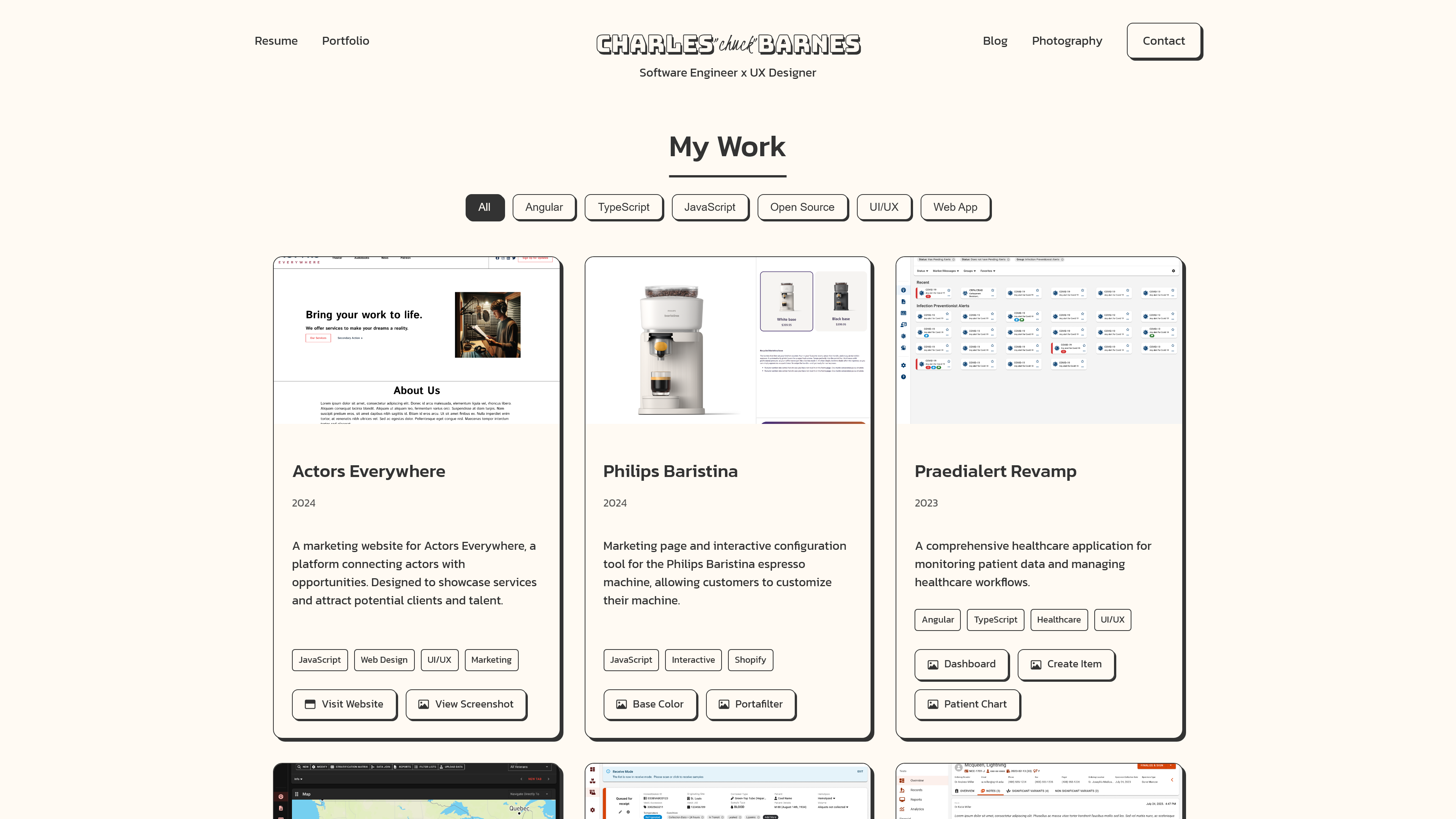 |
|---|---|
| Gallery Page | Portfolio Page |
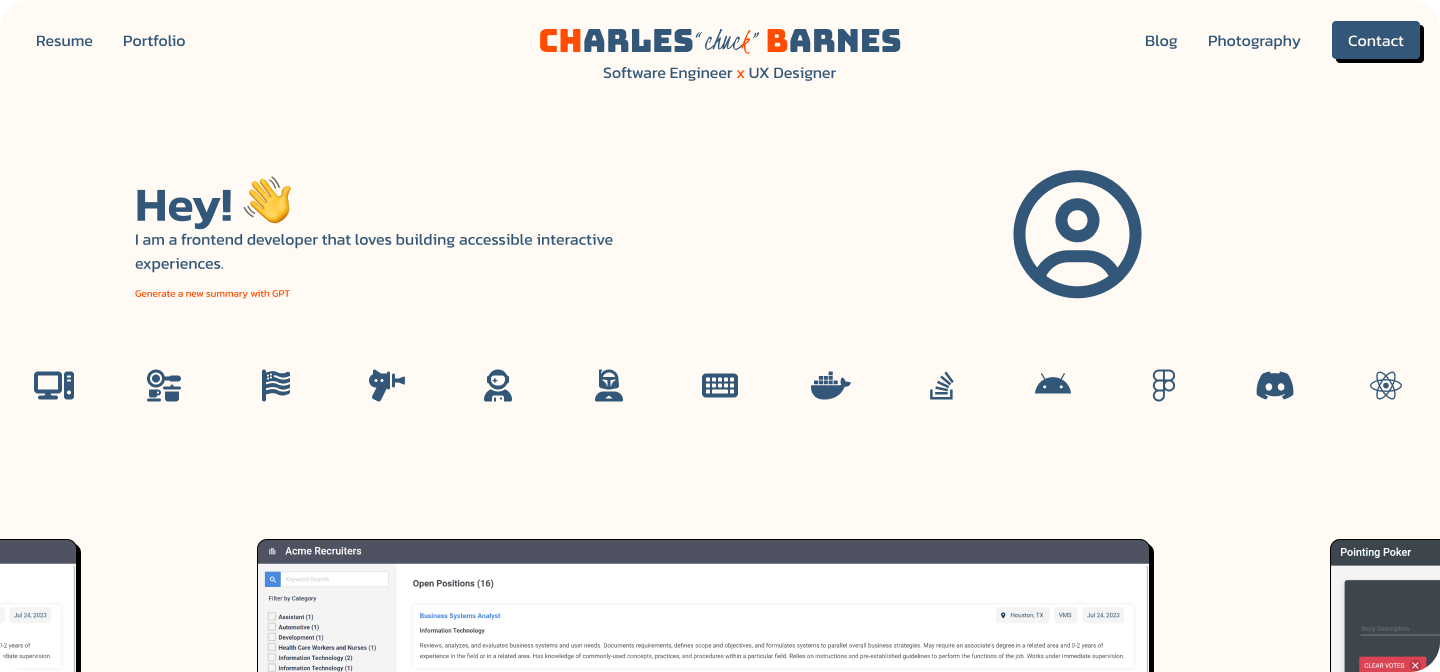
This is the current state of the site. I am still working on it and will be adding more features and styling as I go, but I am happy with the progress so far. I have met all of the requirements that I set out to do.
Future Plans
- Add a search bar to the site.
- Keep adding more content to the site.
- Utilize the github api to pull in projects and display them on the site.
- Add dark mode.
